There’s no escaping colour, it’s all around us – from billboards, to the clothes we wear and the cars we drive. Incorporating bold colour into your home can quickly and easily brighten a space, but it has to be done with some careful thought so as not to overwhelm a space or create unsightly clashes. Anton Odendaal, from leading homeware retailer, Rochester, offers his advice and some easy-to-follow tips on how to make the best choices when it comes to introducing colour into your home environment.
Know your Favourites
The first step in choosing a colour scheme for your interior is picking a colour that speaks to you. And the best way of doing this is by looking at what colours you are drawn to, starting with your wardrobe. “Glance through your closet and pick out the items you tend to wear a lot of, and then translate them into a colour scheme that you can use in your home,” says Anton. If clothing isn’t your thing however, then why not go for a stroll in the park or sit on the beach to draw inspiration from nature. “Inspiration is everywhere,” nods Anton, “You can take your cue from anything – from a pattern in a rug, a colour combination of a favourite fabric or wallpaper, an admired artist, a bunch of flowers, a panoramic vista, or a classic film. Let your imagination play a little to see what families of colour you are naturally drawn to.”
Warm versus cool
All colours can be put into one of two categories: warm and cool. Warm colours generally include red, yellow, orange, brown and cream. Whilst cool colours on the other hand, include blue, green, purple, grey and white.
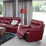
Warm colours tend to be stimulating to the senses, and because they stand out so strongly, they work well on accent pieces. Intimate and welcoming colours, such as red and orange for example, are great for rooms where socialising takes place, such as the kitchen, dining and living rooms.
Cooler soothing colours make for great background colours as they tend to quiet ones emotions and instill calmness into a space. Thus, they are a great option for more private spaces, such as bedrooms and bathrooms for example. However cooler hues can run the risk of being cold and uninviting, especially if used in a south-facing room that doesn’t receive much light, or when they are used in abundance.
With this in mind, decide on whether your predominant colour is going to be warm or cool, and then ensure that you stick to a colour scheme that is predominantly one temperature for a cohesive look. “Once you’ve incorporated your chosen colour temperature into all your bigger items, such as walls, curtains and furniture, the trick is to add small doses of both warm and cool tones with accessories, such as in patterns on rugs and scatters, to create a look that is balanced,” advises Anton.
Take it slow
“When it comes to colour, less is more,” nods Anton, who advises the 80/20 approach. “The general rule of thumb is 80% neutral colours and 20% accent colours in a room,” he explains, adding that bold colours should punctuate rather than overwhelm the space. This approach ensures that you have a well-balanced space. So for the more adventurous this may mean reigning in your inclination to go all out with colour, and for those who are more timid when it comes to colour, it may mean adding an accent wall, an armchair in a punchy upholstery, or a bunch of flowers that picks up on a colour in your rug. “Introduce colour gradually so that you can get a feeling of what works and what doesn’t. This way you can slowly allow the room to take on a life of its own over time,” affirms Anton.
Tips for colourful furniture
Here are a few guidelines from Anton on how to go about selecting the right colour for your furniture and your home:
• Think about the room in its entirety when picking a colour, rather than just focusing on a single piece of furniture. Consider the floors, walls, lighting, curtains, rugs and tables when planning your interiors.
• Keep prints on smaller décor accessories, rather than larger pieces of furniture so that you don’t end up being stuck with a dated or tiresome piece for years to come.
• Pick a dominant colour, and then add lighter and darker colours in a similar tone for a layered and harmonious colour palette that exudes visual texture and interest.
• You can balance bolder colour with more subdued neutrals, such as white or grey, for a more harmonious effect.
• When in doubt choose a classic colour combination that has been tried and tested, such as blue and white for example, or green and brown, or red and black.
• Want to introduce some pops of colour without breaking the bank? Try introducing some accent chairs, lamps, vases or scatters that can easily be changed when you want a different look.
“Rochester’s wide selection of décor accessories is a great place to start when introducing pots of colour into your home,” points out Anton.