
When you’re approaching a rehab center, either for yourself or a loved one, the first thing that greets you isn’t a staff member or a brochure—it’s the building itself. The colours adorning its exterior can speak volumes, even before you step inside.
While it might seem superficial to some, the choice of paint colour is a deliberate decision that reflects the center’s approach to care, philosophy, and environment.
Let’s dive into what these colours might be telling us.
The First Glimpse Matters
Imagine pulling up to a rehab center and being met with warm, inviting colours. Or perhaps, the building exudes a more professional, clean-cut appearance with its choice of paint. These initial impressions play a crucial role in how we perceive the center.
Warm and tranquil colours like soft blues, greens, and earth tones can create a sense of calm and safety, signalling a nurturing environment where healing is a priority. On the flip side, crisp whites and greys may communicate a no-nonsense, professional approach to recovery. Either way, that first visual interaction lays the groundwork for expectations.
The Power Within Colour
Colour psychology isn’t just for marketers; it’s a potent tool in healthcare environments, too. As experts in the field, exterior painters from B Painters would attest that specific colours have the power to influence our moods and emotions.
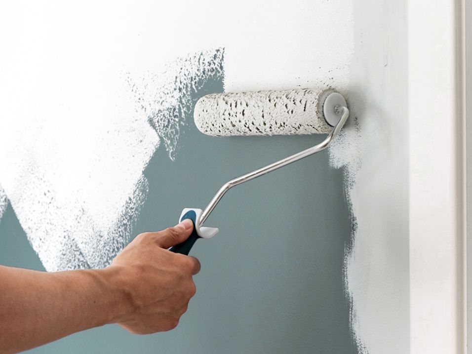
Blue, for example, can have a calming effect, reducing stress and creating a serene atmosphere. Green, often associated with nature, promotes relaxation and restoration.
Choosing such paint colours for their exteriors lets rehab centers are not just making a style statement; they’re subtly indicating their commitment to creating a supportive space conducive to healing.
A Reflection of Philosophy
The exterior paint colour of a rehab center can also clue us in on its treatment philosophy. Earthy tones might suggest an emphasis on holistic, nature-based therapies, while vibrant hues could hint at innovative, energetic treatment programs similar to the approach of the premiere detox facility and rehab in Avanti Restore.
This alignment of colour with the treatment approach offers a visual cue to the center’s methodology, helping individuals align their needs and preferences with the facility’s offerings.
Blending In or Standing Out
A rehab center’s choice of exterior paint also considers its surroundings. In natural, scenic locations, you might find centers opting for colours that blend seamlessly with the environment, embracing tranquillity and the healing power of nature.
Urban centers, conversely, might select brighter, more distinct colours to create an oasis of calm amidst the chaos of city life. This thoughtful integration (or distinction) reflects the center’s awareness of its environment and its effort to either offer a harmonious retreat or a clear sanctuary.
Conclusion
While it’s clear that the choice of exterior paint for a rehab center goes beyond mere aesthetics, it’s a significant element that reflects the facility’s ethos, approach to healing, and level of care. Colours can influence first impressions, emotional states, and even our perception of a center’s philosophy.
