“The most successful projects are when you get to harmonise the whole design, the interior and the exterior into one holistic entity,” says Mike Rassmann, one of the three partners at Architects Of Justice (AOJ).
It was this approach which has allowed the award winning practice’s recently completed Cube Route office and warehouse facility, located on Malibongwe Drive in Randburg, to successfully integrate an interior which ‘speaks’ to the exterior of the building.
“You have a sense of understanding of what the conceptual design is to the building, and can bring that thread right through into the interior which gives you a better product at the end of the day,” adds AOJ’s Alessio Lacovig.
New head office for Cube Route Logistics
The new head office for Cube Route Logistics, a pet food distribution company offering logistics services countrywide and into southern Africa, is an AAA grade office block of roughly 1000 square metres with a warehousing and e-Pet store facility measuring approximately 9000 square metres.
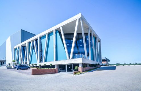
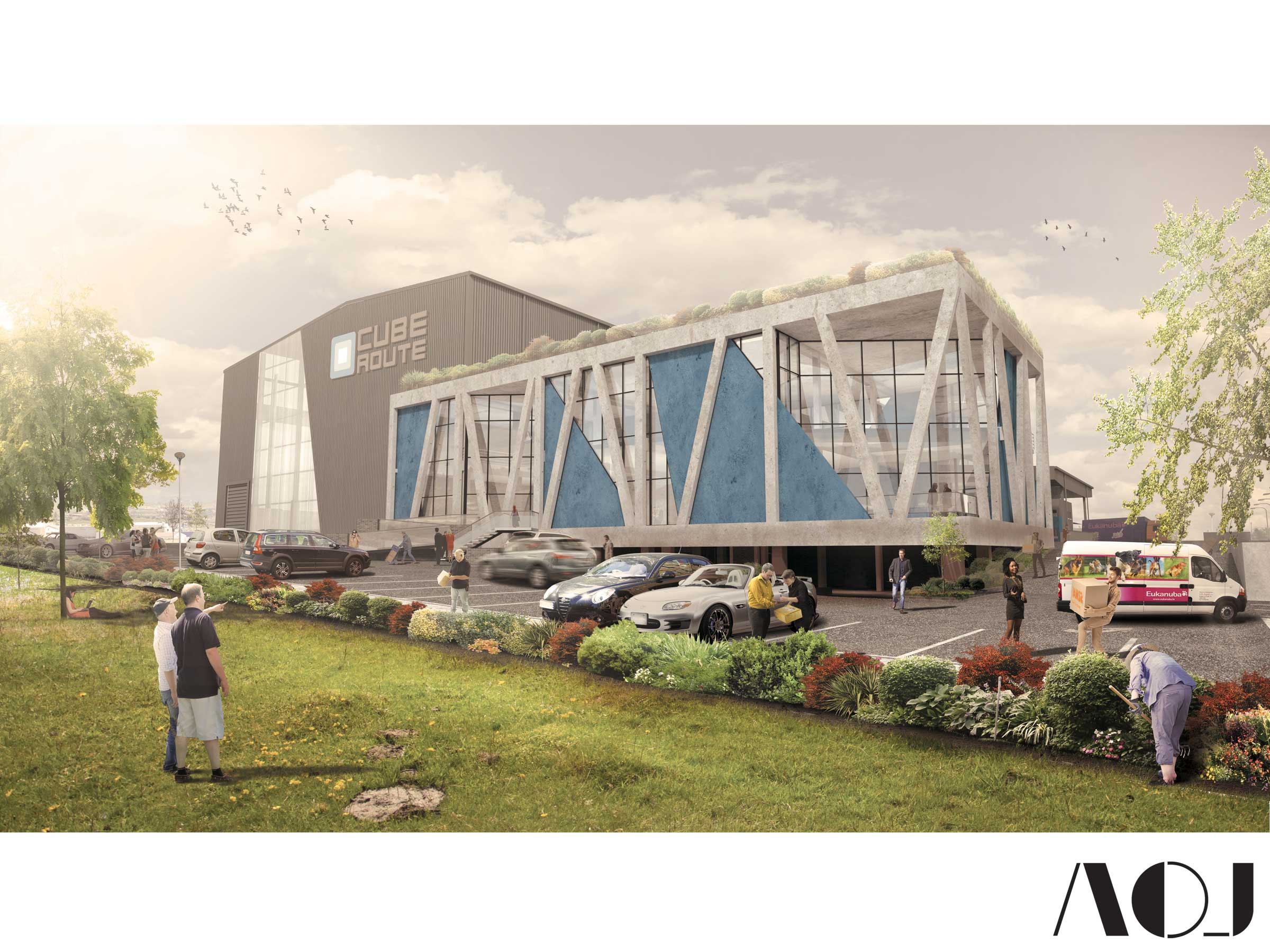
The prominent Malibongwe Drive frontage created an opportunity to design a landmark building that would be impressive to onlookers passing by. This notable, non-conventional facade features an array of off-shutter concrete columns set around the building, over an envelope with judicious colored wall panels spaced between the glass curtain walls.
Ultramodern structure
Described by the architects as an ‘ultramodern structure’, their vision was to present a raw concrete exoskeleton, filled by a pristine, smooth envelope containing a modern, clean and sleek interior.
The juxtapositions of raw and smooth, dull and bright make interesting, striking and memorable architecture. Having designed the shell, AOJ then set about creating an interior which harmonises with the striking façade.
“With a very modern exterior, we wanted to create contemporary interiors as well, which complement the geometry of the building,” says Rassmann.
Due to the step backs in the façade, the office building has a very geometric form which created many angles to work with.
“We provided spaces for staff to sit outside on a large terrace and balconies which overlook the yard areas and the activity below. Internally, the spaces complement the lines and angles of the façade, and we used different finishes, such as striped, colourful carpets mixed in with more muted tones so that it is not too heavy on the eye,” he says.
The architects brought through a fair amount of patterning to follow the diagonal geometries of the façade, working with different carpet colours to create visual interest.
Lighting design
The lighting design was critical to the interior, especially in the spaces were the architects were able to embellish a little more, such as the reception spaces and in the large communal kitchen area in which the staff can congregate, eat or even work in a more relaxed environment.
“We started with a very high end design, and one of the big challenges was trimming that design back to budget whilst still maintaining the same kind of appearance. This included picking the right light fittings, surface mounting them instead of cutting into the ceilings and recessing them, without going completely overboard with bulkheads. We used several pendant lights, hung at different heights, and picked the fittings very carefully to complement the exterior, thus many of the fittings that were picked have a concrete finish,” says Rassmann.
The way the interior and exterior intersected was very conscious; the architects haven’t hidden the concrete structure within the building, rather the interiors match the clean crisp finish of the exterior, and in places the underside of the concrete slab as well as the concrete beams are visible. Rather than ignoring the structure, the interiors acknowledge it.
Glass
Glass played a large part in the interior due to the high ceiling volumes of the space. “We had to get the balance right between glass and dry wall partitioning,” explains Lacovig.
“With glass costing close on seven times as much as drywall partitioning, we raised certain portions of the drywall partitioning to hide the desks and the assorted cabling, but then raised the glass above the desk height. This allowed us to offset the cost of glass, but at the same time strategically position it in the interior to allow a maximum ingress of natural light.
As the offices cater for two separate though related companies (a logistics company for pet projects and an e-Pet store), AOJ had to incorporate these two companies within the one building.
To do this, they created a slightly different corporate identity downstairs compared to upstairs, achieved mostly through colour (green for the e-Pet store and blue for Cube Route).

“One of the challenges of the brief was to organise the way the client wanted the departments to work; in our space planning we had to figure out what they wanted in terms of which departments needed to relate to each other, which needed to be visible, which needed more privacy, and where the large training room would be located in the building. The sales team is located downstairs in a large open plan area along with large meeting rooms, smaller breakaway meeting rooms and the communal kitchen, while accounts, HR and management are housed upstairs. It is a very open company,” explains Lacovig,
“And you can see a personal touch in the way they work.” For instance, they have a strong culture being a pet-centred company and you can often find pets around the office. The warehousing element for stockholding was a large part of the project, as was a showroom space for the retail component. Our practice is particularly adept at laying out a spatial programme across the building to optimise the way a company works,” he adds
“Other than the directors – who also share a workspace – it was only really HR which needed to be isolated. Elsewhere, the staff have shared spaces, but we ensured that they are not cramped, and in fact have capacity to add more staff.”
As far as future proofing for possible future tenants, the spaces are very generous. “Even if staff are added there will still be space and future growth built into the open plan design,” notes Rassmann. “There were plans for Cube Route to add another floor, and the building was designed so it can handle the addition of an extra floor, and it also fits into the model of what town planning allows in the area.”
Interior
The interiors were designed to be as human-centric as possible with abundant natural light, high volumes and extra colour, without coming across as being overpowering and garish.
“From the shape of the façade, it gives staff a very interesting interior space, not your conventional four wall box, so that in itself changes the quality of the space and the perception of the space you are working in, making it a building which is exciting to be in,” states Lacovig.
Sustainably, LED lights, motion sensors and energy efficient air-conditioning systems add to the use of materials which have longevity and low maintenance. The façade was designed with tinted double glazing so the building performs very well from a passive design point-of-view
“The company almost has the feel of a family business – albeit a very large one,” says Lacovig, and with this ethos apparent from the very first meetings, AOJ have managed to create a visually striking building, which internally sparks interest while at the same time ensuring that the staff can interact, work and play (with puppies…) in a building which harmonises both the interior and the exterior.

Leave a Reply