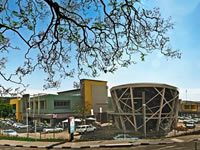
 Located in the bustling heart of Waterkloof , Pretoria, is the newly renovated Waterkloof Corner Shopping Centre. The centre recently underwent a facelift that has taken it from a local convenience shopping centre to a trendy hotspot where everyone wants to meet.
This new contemporary lifestyle centre incorporates unique design concepts, upgraded parking areas and stylish restaurants.
The renovations took place from September 2009 until October 2010, which was highly efficient for a 6500m² building, which includes 23 shops, 2 ATM’s, a gym, spa and offices.
The entrance to the centre was repositioned for improved access and the parking area was re-designed to be more user-friendly.
The anchor tenant, Spar, was also upgraded to reflect the contemporary look and feel of the centre and several new national tenants now occupy the other stores.
“The focus is definitely on specialist boutiques, interior design stores and stylish and hip restaurants,” says Retail Africa’s Richard O’Sullivan.
The acquisition and refurbishment has resulted in an investment for Retail Africa in excess of R60 million.
The newly-refurbished centre is dominated by an iconic structure, “This free-standing construction or “bird’s nest” will draw the attention of passers-by from Crown Avenue and Waterkloof Road and will house eateries and boutiques that will create a meeting place for discerning customers from the surrounding neighbourhood,” says O’Sullivan.
Architectural interpretation
Large elements in the final design are reflective of influences in central Europe, by means of a playful use of colour and shape. Retail Africa’s vision of creating spaces where public art, mosaics and contemporary meeting spaces, was successfully achieved. The facades seem to interact with the public spaces and they have the ability to redefine the shopping center’s existing surroundings.
The architects predominantly used Fibre Cement sheets when creating the design features such as the coloured boxes. This cement technique was also used more subtlety to fill in portions of the existing canopy as well as a direct cladding onto the existing concrete canopy to get a uniform look between old and new.
As a weather resistant and robust material, there was many benefits in choosing Fibre Cement as the primary material when creating these structures as a part of the Centre’s new design. It is a lightweight product which allowed for the opportunity to add-on or clip on to the existing structure, which would not have been possible with more traditional materials such as brick or concrete.
Challenges
The biggest challenge, according to Martie Human (VH+S Architects), was getting rid of a ‘wavy’ effect when they applied the Fibre Cement sheets, especially on the large flat surfaces of the feature structures. “This could be due to not having the sub structure designed correctly and it would be great if one can get a specialist to assist in this regard in future projects”.
“We aimed to create a space that will become a gathering place for the community by virtue of its ambience,” says O’Sullivan. The Centre’s renovations have exceeded all expectations and it is now a local landmark for all to enjoy.
