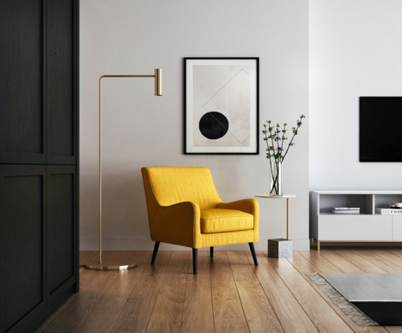
When it comes to generating a sense of visual harmony in a home, designers have endless possibilities, from restricting materials to employing vibrant geometrics and super-bright colors. You must strike the right balance between design elements and color schemes to make the entire home feel cohesive, calm, and put together. This article focuses on the most effective designer tips for creating more visual harmony in a home.
Generate a Clear Theme and Concept
Start by generating a clear theme for your entire home, including interior and exterior spaces. This theme will act as a bedrock to guide all your design decisions and help answer essential questions related to the style and desired mood.
It will also guide you in choosing a color scheme, including matching siding colors, promoting consistent decision-making, and allowing all design elements to work together seamlessly for a vibrant and visually pleasing environment.
Add Symmetry
Symmetry naturally cultivates a sense of order in any space and enhances Visual Harmony in a Home. It develops a rhythm in the home that draws the eye. You can create symmetry by embracing the idea of multiples and positioning matching pieces on each side. Matching lamps, a set of chairs, curtains, and tables are some good options for adding symmetry to an interior space. Consider extending symmetry into the landscape design by adding oversized planters or lanterns on both sides of the front door or garage.
Introduce Contrasting Elements
Contrasting features like patterns, colors, textures, and materials can add depth and variety to your home interior design. They break the monotony to stimulate visual interest. For instance, you can pair textured accents with sleek and smooth surfaces or integrate bold patterns to promote an interplay of contrasting elements.
Keep in mind that moderation is key when using contrasting elements. Excessive contrast can lead to visual dissonance, making your home appear chaotic and busy. About two accent colors for accessories can perfectly strike the right balance.
Emphasize Visual Balance
Eliminate the chances of having too much weight on only one side of the entire space. This can be in terms of decor, a dark color, or multiple large pieces of furniture contrasted with an empty and dull space. It leaves the entire home feeling unbalanced. The best thing to do is to position your furniture, decor pieces, and color in places that can help create a balance.
Select a Unifying Element
The right unifying element can infuse harmony into your space. One way to create an anchor is to get a dominant furniture piece, such as a large sofa, in your color of choice. Once you have the color scheme, incorporate it into other elements, such as curtains, wall facades, and chairs, to induce visual unity. It also offers a solid foundation to introduce secondary elements in complementary textures, patterns, and colors.
Treat the Entire Space As a Whole
During the planning phase of creating Visual Harmony in a Home, pay more attention to the home’s overall look rather than getting entangled in individual elements. Your aesthetic vision should be at the forefront when choosing lighting, false ceilings, color palette, and furniture. The holistic approach helps establish an unshakable foundation for harmony and unity to ensure that each detail works towards a cohesive whole.
To attain harmony, balance, and visual appeal when designing a home, have a nuanced understanding of the contrasting and complementary elements. These designer tricks are eye-openers for helping you achieve that perfect look.

Comments
One response to “6 Designer Tips to Create More Visual Harmony in a Home”
Great article on social media strategies! I found that creating engaging visual content has really helped boost our social media presence. If anyone is interested, we’ve compiled a list of tools and tips for creating compelling visual. It could be a useful resource for those looking to enhance their social media strategy.