Walk into a store that feels right, and you might not immediately know why. Nothing is screaming at you. No giant sale sign is blocking your path. You just feel like looking around. That feeling does not happen by accident. It is the result of a layout designed to pull you in slowly rather than push you toward a checkout as fast as possible. Retailers who understand this are building spaces that feel good to be in, and that feeling translates into real loyalty and sales.
How Store Flow Actually Shapes Shopper Behavior
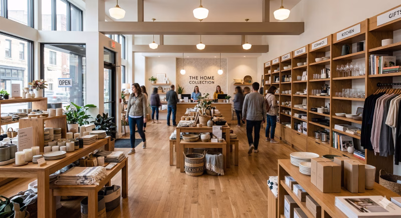
Most shoppers do not enter a store with a fixed plan. They have a vague idea of what they want, and the layout either opens that idea up or shuts it down. When aisles are too direct, and shelves are stacked with too much information, people go into task mode. They grab what they came for and leave. When a layout creates small detours, unexpected corners, and little moments of discovery, people slow down.
Retail design consultant Erin Morris has pointed out that stores failing to hold attention past the first two minutes are missing a massive revenue window. That first stretch of a shopping trip is when curiosity is at its highest. If the layout does not feed that curiosity early, it dies off fast.
Stores that use decompression zones at the entrance give shoppers a moment to shift mental gears. A slightly open area near the door, without heavy product placement, tells your brain that exploration is welcome here. It is a subtle permission slip to slow down.
Zones That Invite Rather Than Direct
There is a big difference between a layout that tells you where to go and one that makes you want to go somewhere. The first uses logic. The second uses feeling.
Curiosity-rewarding layouts tend to break the store into loosely defined zones rather than strict departments. You might move from a lifestyle display into a product section without a clear boundary. That blurring keeps shoppers engaged because they are not sure where one thing ends and another begins. It feels more like browsing a well-curated home than navigating a grid.
Low fixtures also play a role here. When shelving stays below eye level, shoppers can see across the store. That visibility creates a sense of possibility. You see something interesting in the distance, and you want to go check it out. High walls and tall shelves kill that pull by boxing people in.
Product Placement as a Storytelling Tool
Smart layouts use product placement to tell a story. Instead of grouping items purely by category, they group by use, by mood, or by lifestyle moment. A camping section might sit next to cold-weather gear, which sits near a small display of trail snacks. No single item is isolated. Each product hints at the next.
This approach turns browsing into a kind of narrative. Shoppers find themselves picking up items they did not plan to buy because those items make sense in the context around them. It is not manipulation. It is curation. There is a difference.
Seasonal rotations also matter here. When core sections shift every few weeks, regular shoppers keep finding new things even on repeat visits. A loyal customer who knows your store layout is not necessarily bored by it. They are actually more likely to notice when something new appears, and that novelty keeps them engaged.
Lighting and Surface Texture as Invisible Guides
People do not consciously follow lighting, yet they do. Warmer, softer light draws attention and slows pace. Bright, even lighting speeds people up. Retailers who want shoppers to linger use pools of warm light to create focus areas rather than lighting every square foot the same way.
Surface texture works similarly. A rough wooden floor section feels different underfoot than smooth tile. That sensory shift, even a small one, signals a change in environment. It prompts shoppers to look up and take in where they are. Smooth tile tends to encourage fast walking. Textured surfaces, rugs, and softer flooring materials encourage slower movement.
Key ways lighting and texture quietly guide shopper behavior:
- Warm light pools slow foot traffic and draw the eye toward featured products or display areas.
- Bright uniform lighting signals efficiency and speed, which works for grocery but not for browse-first retail.
- Textured flooring like wood planks or area rugs creates a subtle pace change that makes shoppers look up and take notice.
- Smooth tile keeps people moving fast, so use it in transition zones rather than discovery areas.
- Low ambient music at a slow tempo extends the time spent in the store without shoppers realizing it.
- Silence or fast music both work against lingering; one creates discomfort, the other creates urgency.
Sound design ties into this, too. Ambient music at a low tempo and moderate volume has been shown consistently to extend time spent in a store. Fast music speeds people up. Silence creates mild discomfort. In many ways, getting this balance right can feel like a landmark development in how retail spaces influence behavior. Stores that achieve it create an auditory backdrop that makes the space feel alive without being distracting.
Permitting Shoppers to Pause
One underused strategy is creating physical reasons to stop. Seating areas scattered through a store are not wasted space. They invite companions to sit while the primary shopper browses more freely. They give tired shoppers a reason to stay rather than leave. They signal that the store does not need to rush you.
Small interactive displays, product testers, and demo stations serve a similar purpose. When someone picks something up and tries it, their investment in the experience grows. They have spent time with it. That emotional attachment changes the decision from a transaction into a discovery.
Stores that reward curiosity are not just more pleasant to shop in. They are more profitable, more memorable, and more likely to earn a repeat visit. That is not a coincidence. It is designed to do exactly what it is supposed to do.
Q1: What is a curiosity-rewarding retail layout?
Answer: A curiosity-rewarding retail layout is designed to encourage shoppers to explore the store at a leisurely pace rather than rushing to make a purchase. It features elements like decompression zones, loosely defined zones, and engaging product placements that invite curiosity and exploration.
Q2: How does store layout affect shopper behavior?
Answer: Store layout significantly impacts shopper behavior by either promoting quick, task-oriented visits or encouraging leisurely browsing.Layouts that create small detours and unexpected corners keep shoppers engaged and allow curiosity to thrive, leading to longer visits and potentially more purchases.
Q3: Why are decompression zones important in a store?
Answer: Decompression zones are important because they give shoppers a moment to adjust mentally upon entering the store.These areas, typically open and without heavy product placement, signal to shoppers that exploration is welcome, allowing them to shift gears and feel more comfortable taking their time.
Q4: How can lighting and surface texture influence shopping behavior?
Answer: Lighting and surface texture can subtly guide shopper behavior by affecting their pace and focus.Warm, soft lighting encourages shoppers to linger, while textured surfaces promote slower movement.Conversely, bright lighting and smooth surfaces can speed up foot traffic.It’s all about creating an inviting atmosphere that enhances the shopping experience.